Palm Dashboard
A multi-tenant PR workspace that brought campaign planning, coverage tracking and performance reporting into one place for teams and clients.
2025
- Client
- Palm PR
- Type
- Multi-tenant SaaS workspace
- Stack
- Laravel, Inertia + React, MySQL
- Team
- Sole designer and developer
Going beyond reporting
Connecting the work behind PR performance.
Palm started as a request to improve reporting. What we found underneath it was a bigger operational problem.
Initial proposal
Bring performance data into one place for clearer client reporting.
Discovery
Campaign planning, coverage tracking and reporting were spread across spreadsheets, documents and disconnected tools, creating repetitive work and limited visibility.
Product response
Replace the fragmented process with one connected workspace.
Mapping the reality.
The work happened everywhere.
Problem
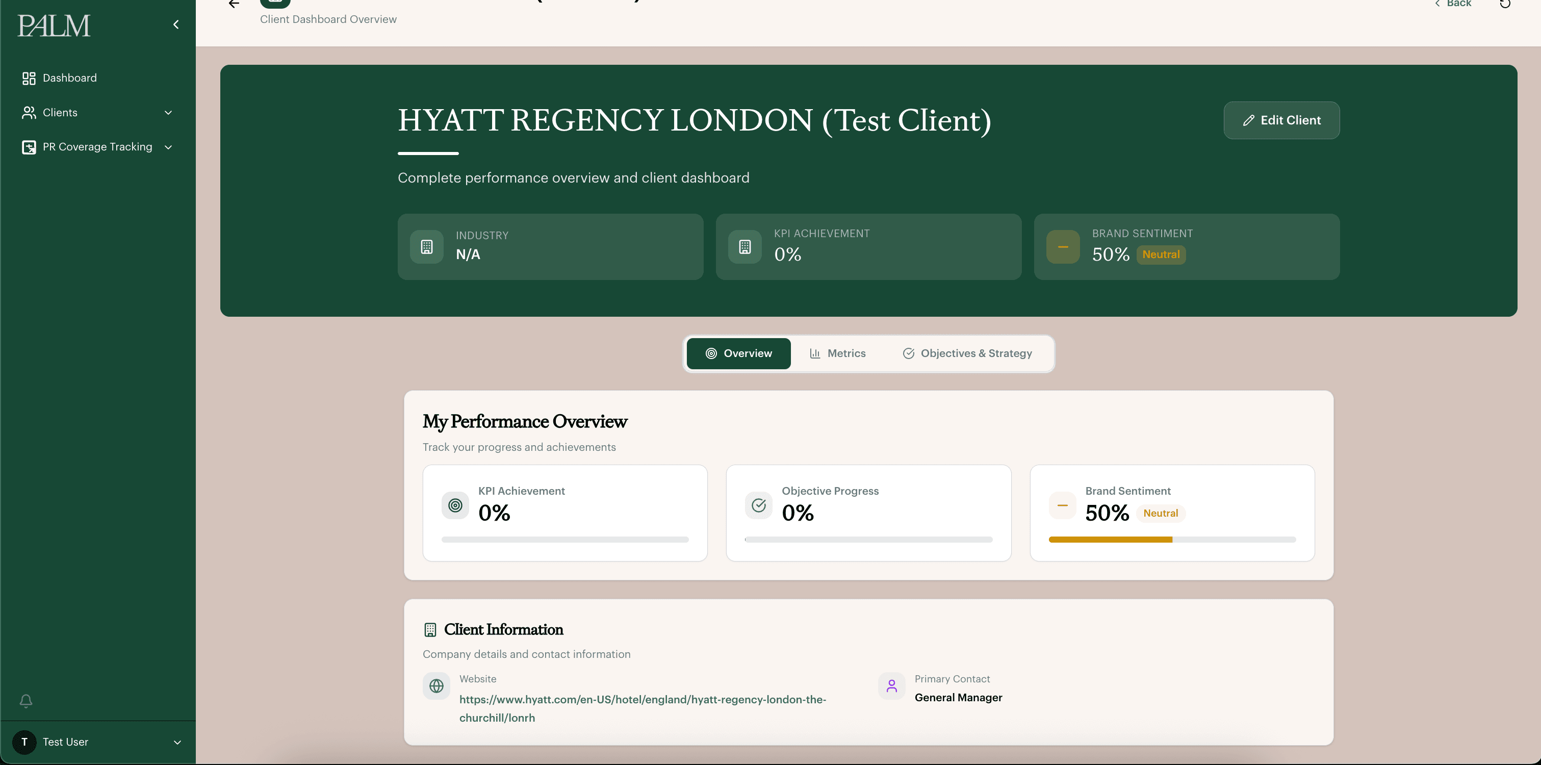
Client information lived across Word documents, emails and internal notes, so the team re-entered the same details at every stage. This created inconsistent client context and duplicated admin.
Solution
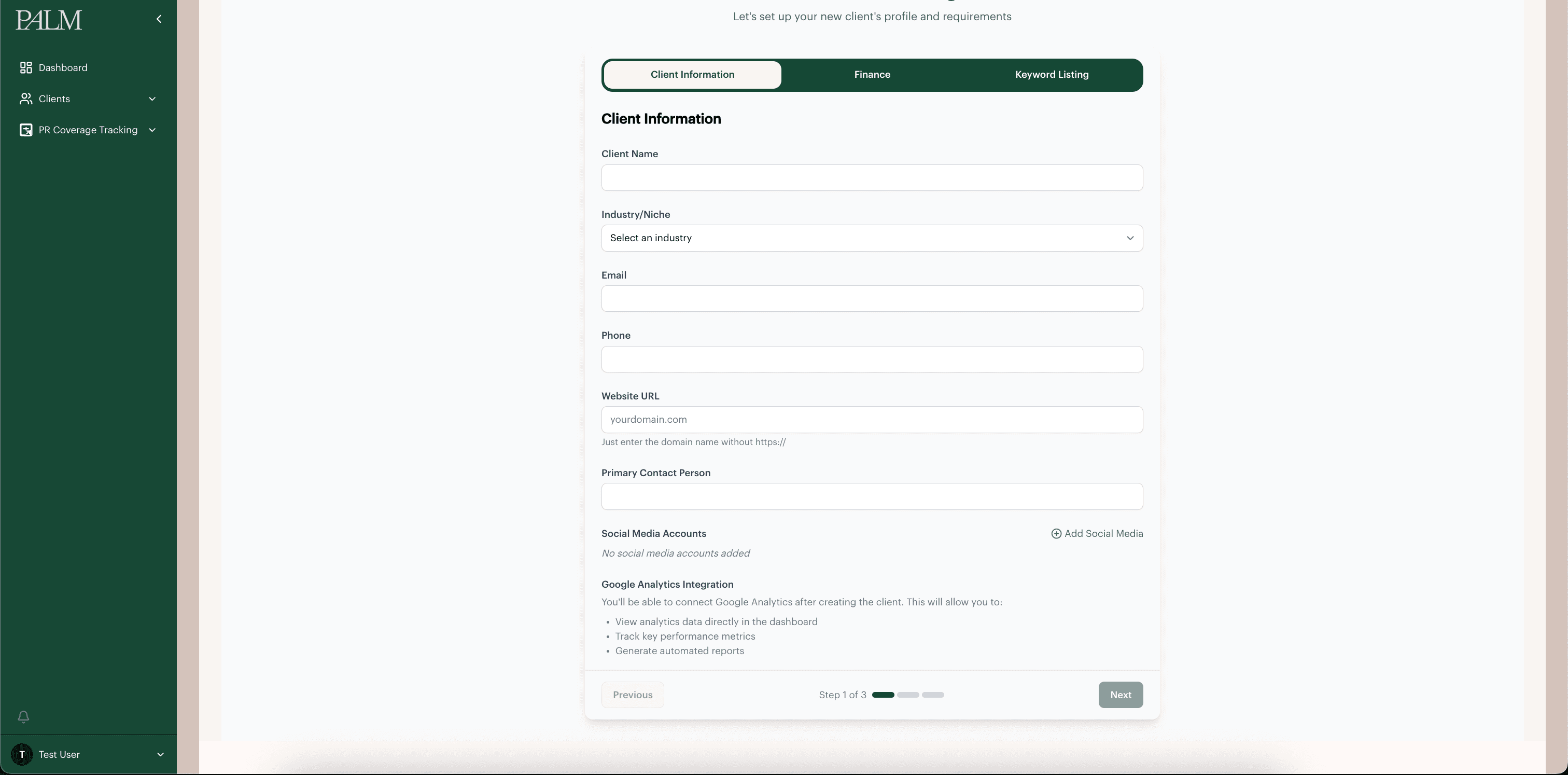
A structured onboarding flow centralising client information, finance details and PR tracking configuration, including keywords and brand terms.
Before
- Brief documents
- Excel spreadsheets
- Finance information held separately
- Internal setup notes
After
- Three-step onboarding flow
- Client information structure
- Finance and contact setup
- Keyword and brand-term configuration
Problem
Objectives, KPIs and campaign strategy were documented separately from the day-to-day work of running a campaign. This made it harder to keep activity connected to the original client goals, and meant strategic decisions could drift from planning and coverage activity.
Solution
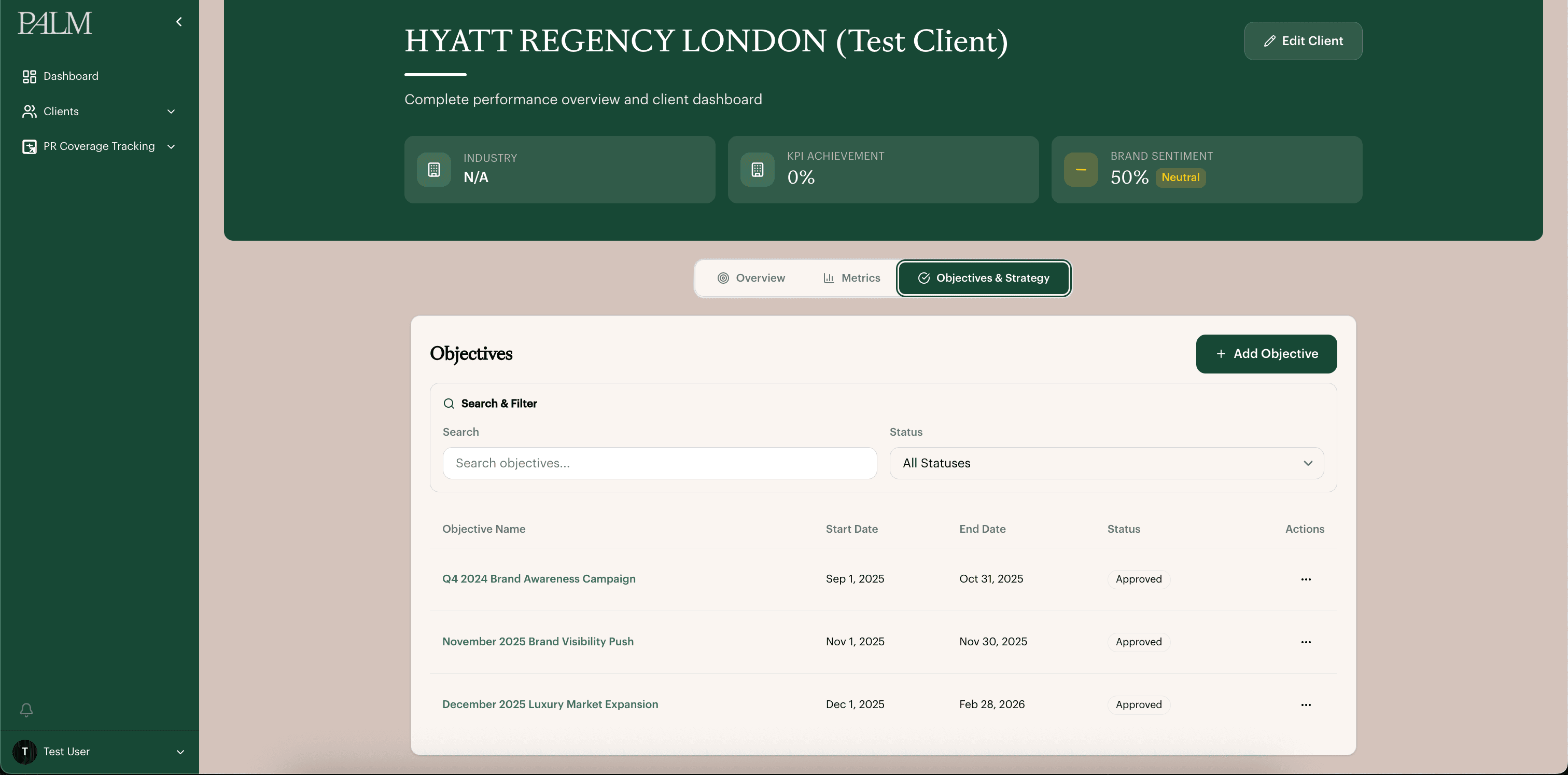
An objectives and strategy area connecting campaign goals, KPI targets, tactics, activities and timeplans into the same workspace as planning and coverage.
Before
- Strategy documents
- KPI spreadsheets
- Client objective documents
- Manual progress tracking
After
- Objectives structure
- KPI target mapping
- Tactic to activity to timeplan flow
- Coverage linked back to objectives
Problem
Customer information was available but hard to navigate. Audience details, behaviours, pain points and messaging were often grouped together without clear structure, making it difficult to understand segments or find insight during planning.
Solution
A dedicated customer profiling module separating customer information into clearer profile cards and structured fields, making audience insight easier to scan and reference during campaign planning.
Before
- Clustered audience notes
- Unstructured customer information
- Persona documents
- Client briefing notes
After
- Customer profile cards
- Structured audience fields
- Profile creation and editing flow
- Scan-friendly layout
Problem
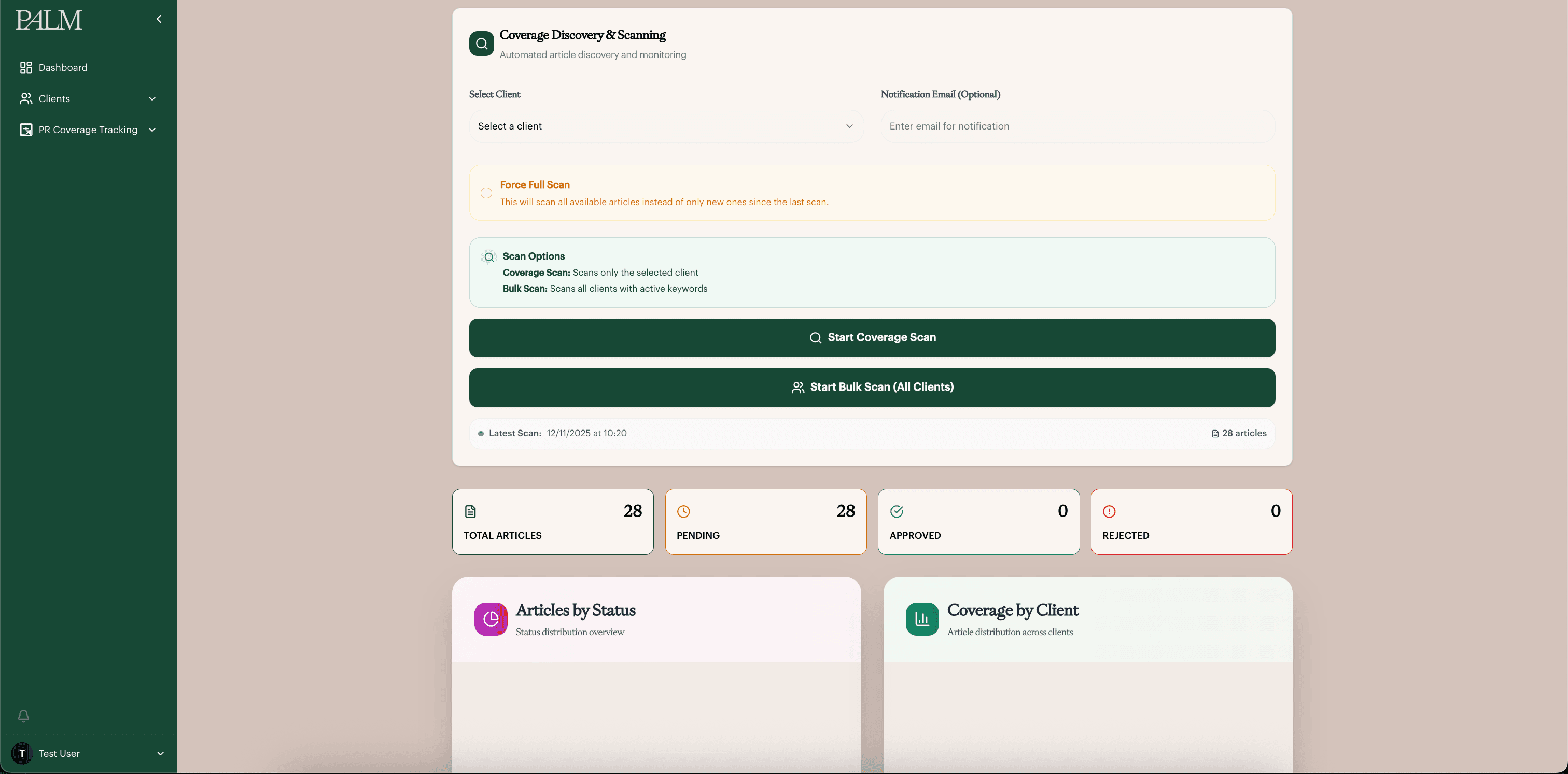
The team relied on a third-party tool that emailed every article matching agreed client keywords, landing in the same inbox used for the rest of the business. Most returned articles were not relevant, so every mention had to be read and filtered manually before anyone could act on it. Coverage records became inconsistent and relevant links could be missed.
Solution
A keyword-driven coverage tracking workflow using automated Google News search via ScrapingBee. Relevant client and keyword mentions are brought into a review space where the team can approve, reject, classify and organise coverage before connecting approved articles to KPI points and brand-awareness scoring.
Before
- Separate media monitoring platform
- Manual article review by email
- Coverage links saved across documents
- Keyword mentions missed or duplicated
After
- Automated coverage discovery
- Pending / approved / rejected workflow
- Media type, tier and category taxonomy
- KPI-linked approval workflow
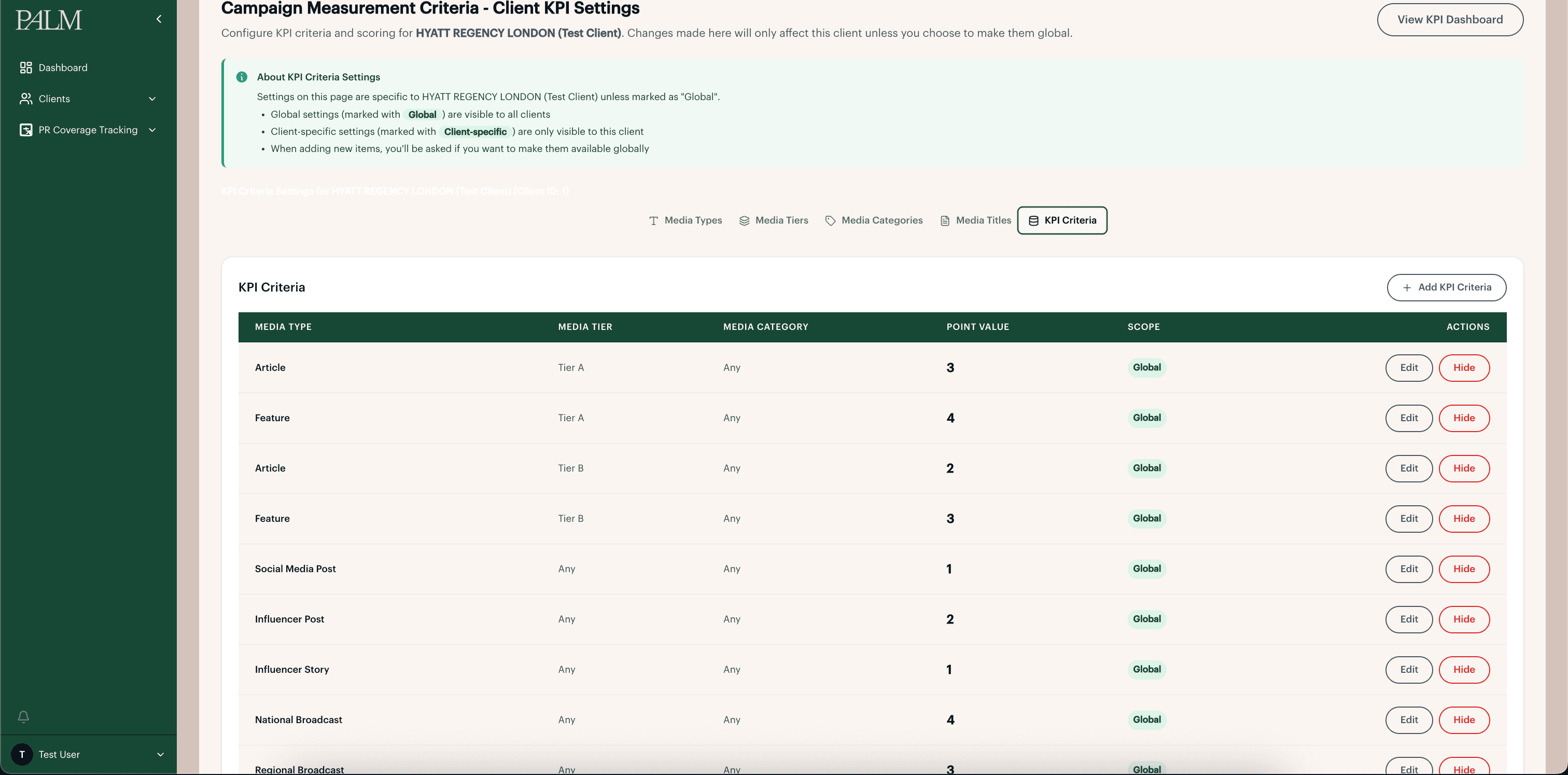
Problem
Performance data lived across multiple platforms including analytics, search and SEO tools. The team had to gather and interpret data manually before turning it into a client update. The challenge was not only bringing data into one place, but making it easier to understand what changed and why it mattered.
Solution
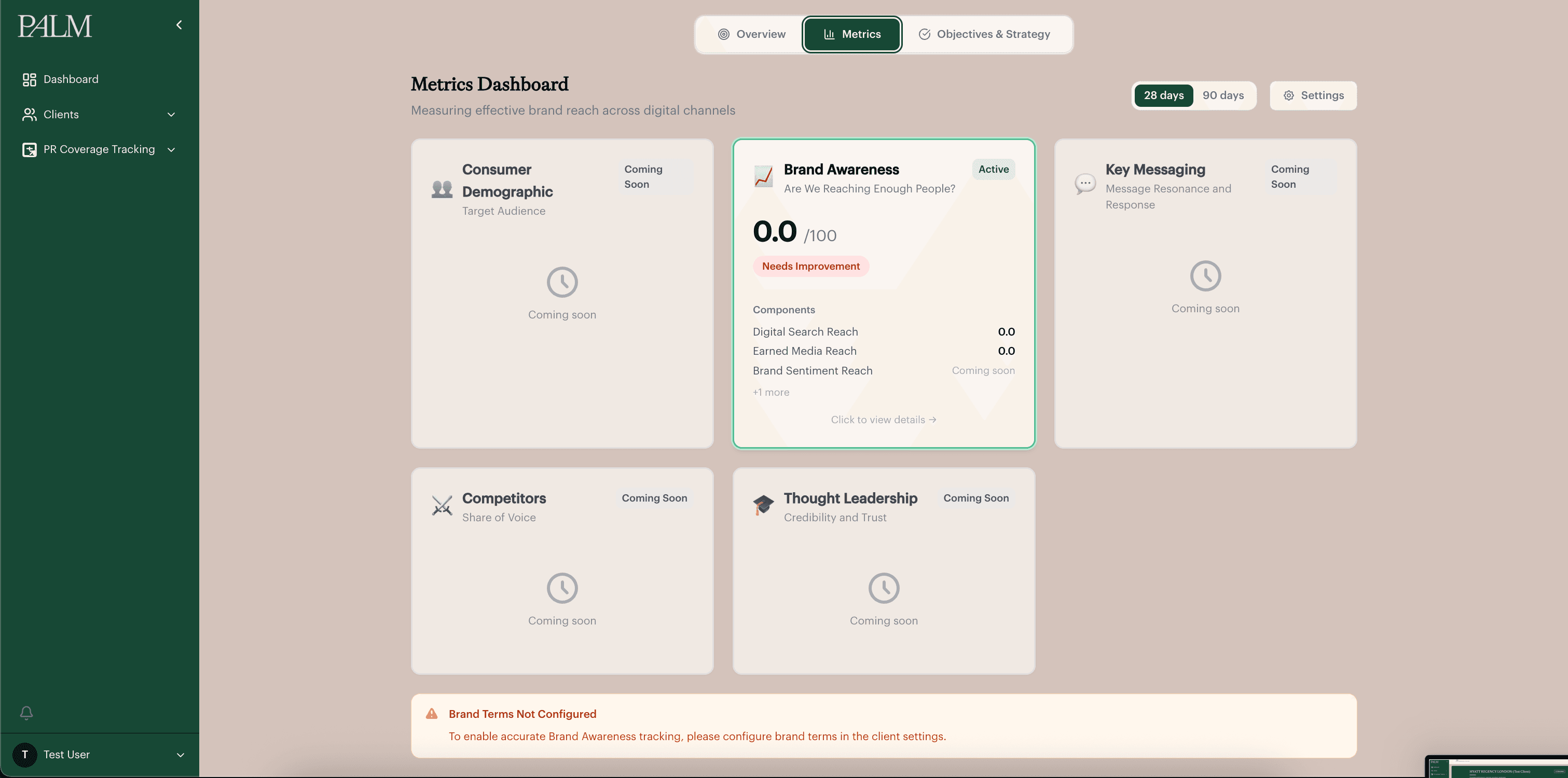
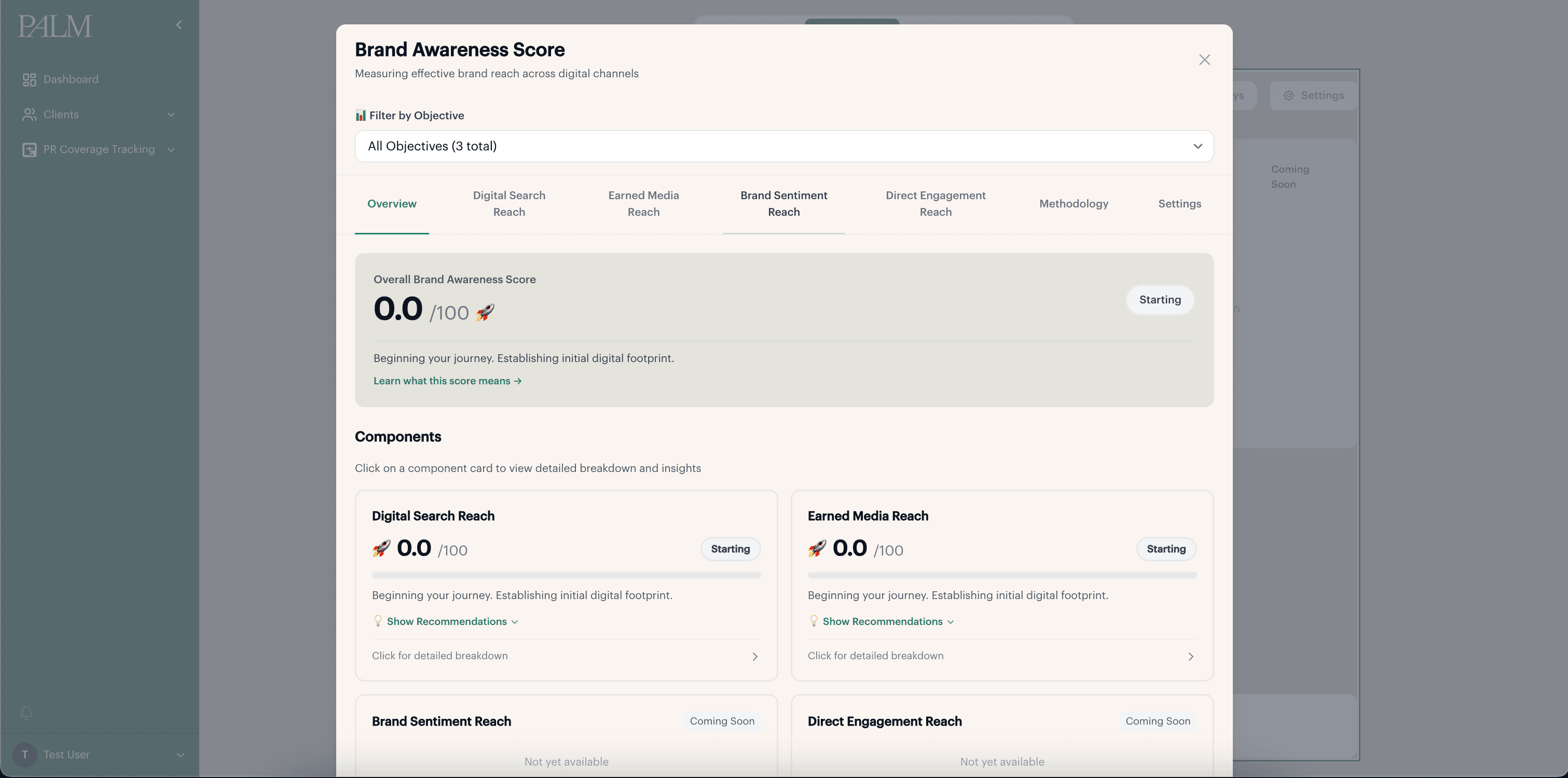
A metrics area bringing GA, Search Console, SEMrush and coverage data into pillar-based scorecards. The active Brand Awareness pillar connects search visibility, coverage and scoring logic into a clearer performance view. Additional metric pillars are structured as future areas.
Before
- Google Analytics
- Google Search Console
- SEMrush
- Manual reporting spreadsheets
After
- Metrics area structure
- Pillar-based scorecards
- Brand Awareness scoring
- Coming-soon metric pillars
Problem
Turning coverage activity into branded client-facing materials was manual. Because coverage information came from different places, the process was repetitive and inconsistent, especially when preparing article summaries, exports or presentation-ready outputs.
Solution
A coverage reporting workflow allowing approved coverage to be turned into branded, presentation-ready exports. The live flow supported individual article exports. Broader period-based coverage reports were explored as part of the product direction.
Before
- Manual report documents
- Presentation decks
- Copied screenshots
- Manually formatted article summaries
After
- Approved coverage records
- Branded article export flow
- PDF / PPTX article output
- Period-reporting concept
04 / Design deep-dives
Inside three decisions that shaped the product
Three areas where the workflow model became a real interface. Each one covers the problem as the team experienced it, the decisions I made and why, and what shipped.
From scattered documents to one connected timeline
Problem
Objectives, tactics and timelines lived in templates rebuilt from scratch for every client, split across documents and spreadsheets.
It was the longest process on the team, time better spent generating income than duplicating paperwork.
Contribution
Product designer, working from Palm's existing four-layer structure — objective, tactic, activity, timeplan — rather than inventing a new one.
Constraints
- Users were largely non-technical, so navigation had to stay familiar.
- Terminology from existing client documents had to carry over so onboarding did not require retraining.
Two views, one data model
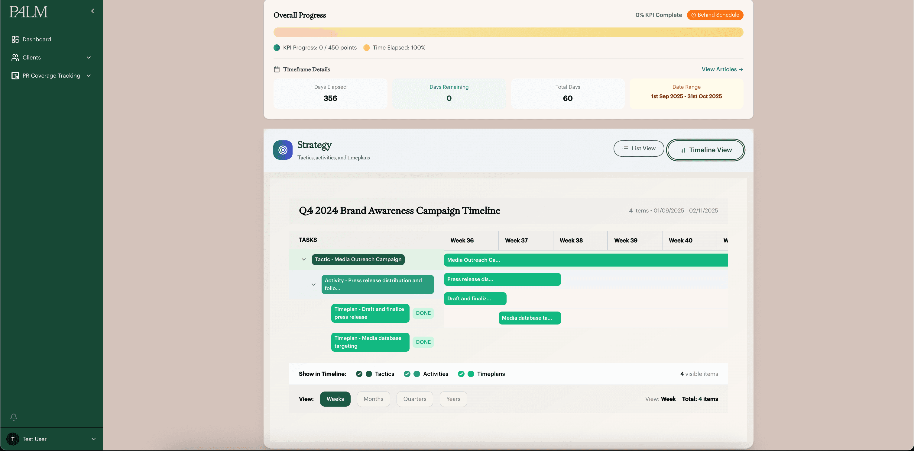
A nested list for detail work and an auto-generated timeline for overview, rather than forcing one view to do both jobs.
Colour by layer, not by status
Tactic, activity and timeplan each hold a fixed colour so hierarchy reads at a glance, deliberately kept separate from status or priority coding.
Automate the schedule, not the thinking
The system builds the visual timeline from entered activities. What to plan stays a human decision.
Designed directly through iteration in code rather than in Figma first — a deliberate trade-off given the timeline. After: objective detail, timeline view. Colour marks layer (tactic, activity, timeplan), not status.
Outcome
Shipped while I was there. Internal feedback credited the timeline automation specifically with removing a task that used to take around an hour per client.
05 / Design to code
Where building protected the design
Most product designers can't build. Most developers don't think in interaction and hierarchy. On Coverage Tracking I owned both sides, so a handful of decisions were shaped by how the system actually behaved, not lost somewhere in a handoff.
Finding coverage without slowing the team down
Coverage Tracking scans the web daily for articles that mention a client's agreed keywords, brand names, products or topics. Because that scan runs against an external search service, it can take time, so it runs in the background rather than making anyone wait. The team can keep working while a scan is running, and check back once results are ready to review. This replaced a process where staff had to manually search for and read through mentions one at a time.
Handling scans that stall
External scans can occasionally fail or take longer than expected, often due to caching issues or stale results from the search service. To keep the process reliable, we built in a visible scan status and a cancel action, so the team can see what's happening and step in if a scan gets stuck, rather than being left waiting with no explanation.
Scoring coverage against each client, not the article itself
An article's value isn't fixed, it depends on which client and which objective it's being measured against. So instead of scoring the article on its own, the score is tied to the specific client relationship. That decision directly shaped the review screen: when staff approve a piece of coverage, they're scoring what it's worth to that client, not giving the article a single, generic rating.
Shown with a test client before full data population. Score ranges, subcomponent breakdown and tab structure carried through from design to build.
- Laravel
- Inertia + React
- MySQL
- ScrapingBee
- Tailwind
06 / Outcome and status
Where the product stands
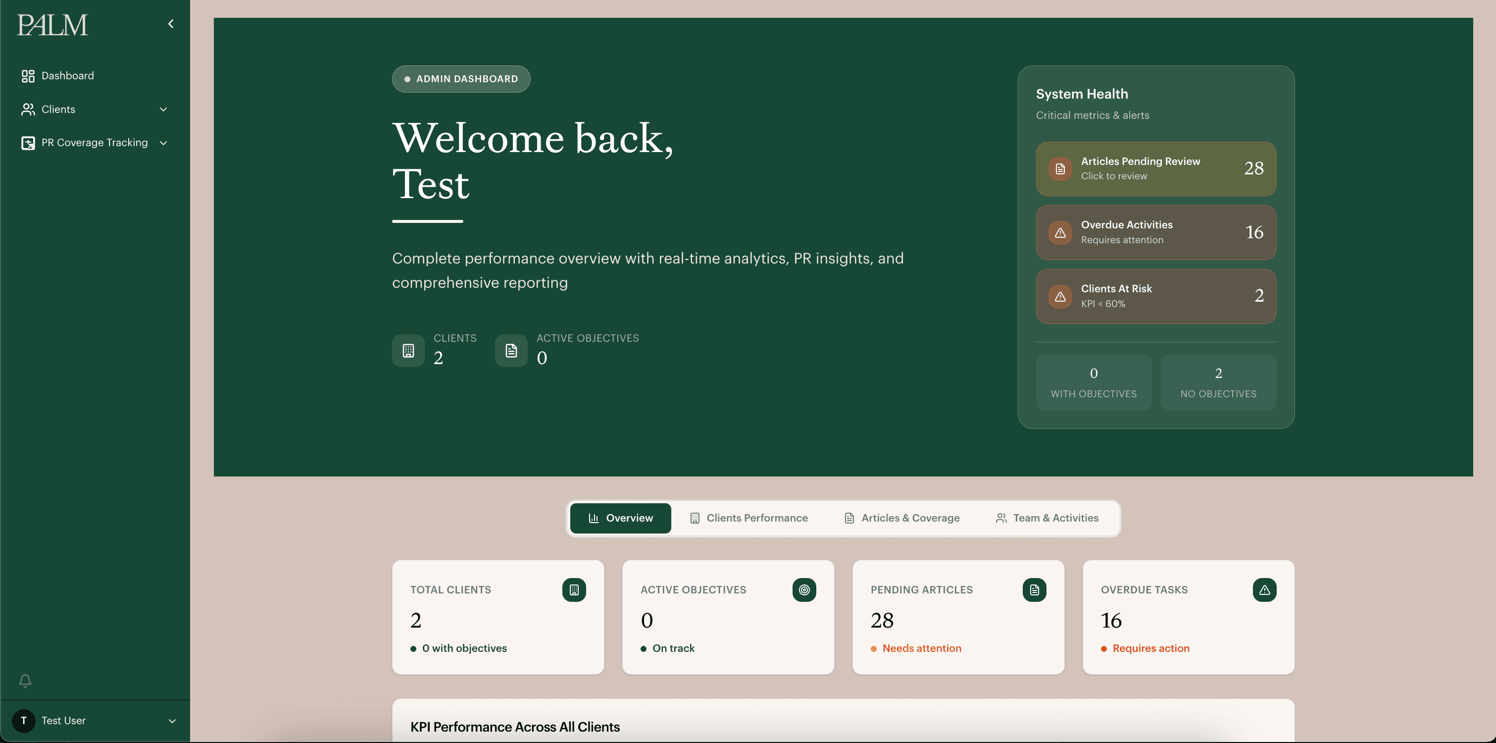
Four modules shipped while I was there: onboarding, objectives and strategy, customer profiling, and coverage tracking. Performance analysis and coverage reporting had their structure. I left Palm PR. I am not working on this, and there is no developer continuing it.
This is going to reposition Palm into the front-row leaders of PR tracking. We have an application that not only helps the client understand performance but also allows them to see their fallback and how they could improve and leverage their current keywords.
This has made the onboarding process a lot easier, and the fact that we can have this all manageable in a single document is amazing. Before, when we made one update, we would have to make it in different documents, which made the process so long. This automates and speeds things up so much more.
Evidence
- Building an Excel timeline manually took around an hour per client. That step was removed entirely once the timeline was generated automatically from entered activity.
- Word document use was reduced across onboarding and reporting, cutting time previously spent re-entering the same information into separate templates.
What's next
The next step identified was an LLM to compare incoming articles against a client's keywords and KPI criteria. I left before that work started, and there is no developer on the product now.
Reflection
The biggest lesson was underestimating how much time data retrieval would take, working out how to extract and structure the analytics data properly, and building the right formulas around it. That slowed the original plan more than expected. If I did this again, I'd also want a larger tech team from earlier on, so development work could be delegated and I could spend more time focused on UX and UI rather than splitting attention across both.